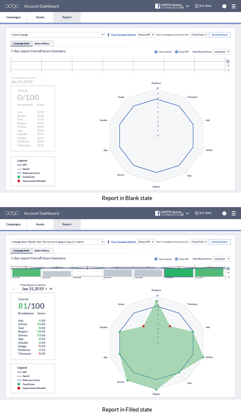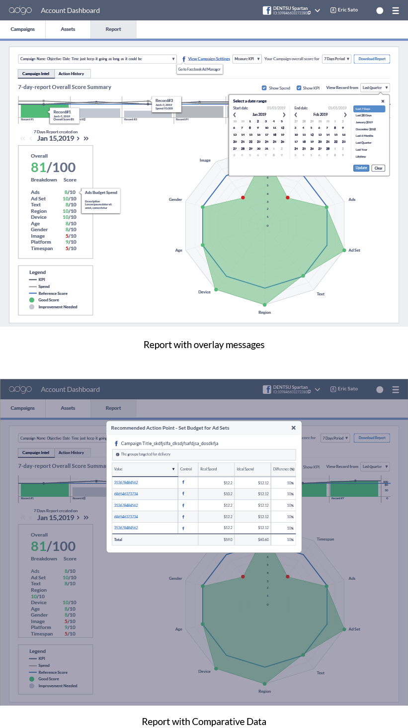
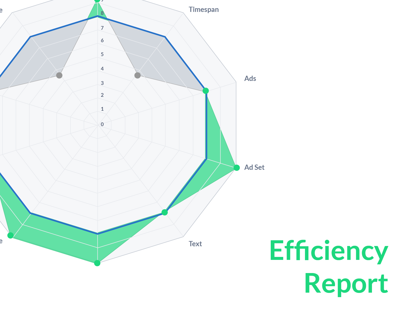
The Adgo service also has a detail reporting to let our customers aware of their online advertising performance and how to accurately improve the ads results. By using a spider chart and bar chart, it helps users visualize the performance at first glance.
My role
Design research
Journey mapping
UI/UX design
Prototypes
Internal User testing
The challenge
The raw data is extremely big and very complicated. Unless there's an analytic sitting next to the client, it's almost impossible to explain our users the analysis result and the required action point. This project required many discussions and negotiations between data scientists, developer, and customer success staff to find the right middle ground that is aesthetically pleasing report along side with necessary data.